Little Red Riding Hood
15 November 2023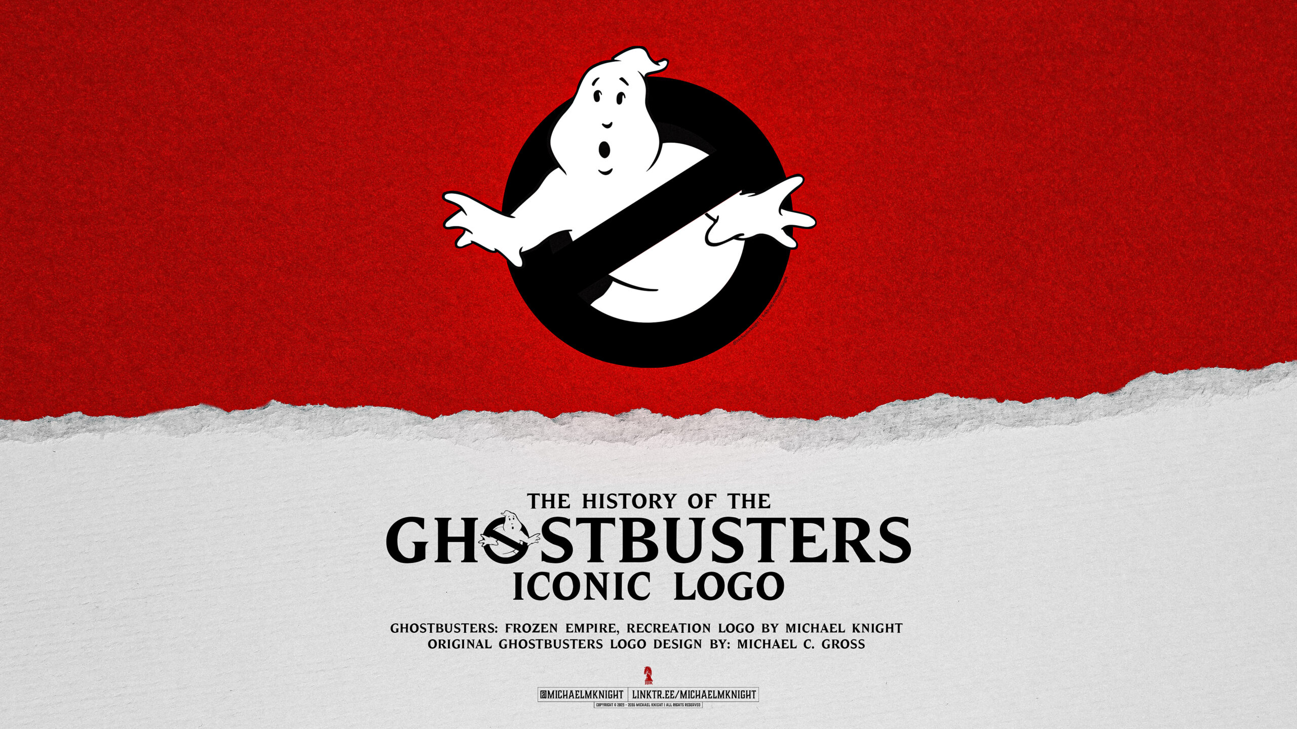
Although I reworked/redrew this dark version of the Ghostbusters logo for Ghostbusters: Frozen Empire’s release in 2024, the logo itself has a remarkably interesting history, and did you know, the Ghost in the logo has a name? Read on…
The visual identity that’s used today is still based on the first original logo that was created in 1984. The reason that this first logo, a black outline with a white ghost and No symbol emblem for the ‘O’, was popular was because it treated ghosts as if they were mundane and something that you didn’t have to fear.
Although the ghosts would look intimidating and scary in the movies of Ghostbusters, the logo made them seem simple, and adorable, mocking the intimidating ghosts that are seen in the movie.
This logo wasn’t only used on merchandise and posters for the show but it was also used in the movies itself. It was used as a business logo for the main characters in the Ghostbusters and the logo was worked on for several years before it officially became the main logo in 84.
It’s clear that this logo was popular and continued for all the Ghostbusters movies, playing a critical role in the franchise. This logo was the base for the changes that would be made to the logo and made the final logo possible.
The Design
Dan Aykroyd, the co-author of the Ghostbusters movie, was the one with the idea of the iconic and revolutionary 1984 Ghostbusters logo. Although Dan was the one with the idea of the logo for the movie, Michael Gross was the one who brought it to life with his incredible design talent. He created two of the most iconic pop culture images of the 20th century, one being the 1984 Ghostbusters logo and the second being the cover of National Lampoon.
Michael C. Gross was an illustrator, an artist, and a film producer and used his skills to make such a mark on Ghostbusters that it’s stuck with the show for decades. Dan may have been the mastermind behind the idea for the logo, but Michael executed it brilliantly and was the one to bring Dan’s vision to life through his work. Some people believe that Michael had helped with the creation of the logo from another graphic designer, Brent Boates.
Michael passed away on November 16th, 2015 from cancer. The artist had survived cancer for 30 years, but in 2014 he was given a terminal diagnosis and at that time decided to forgo any life-extending efforts. Michael “went down fighting”, staying strong throughout his remaining time alive and making it memorable with a “Flip Cancer” campaign. When asked, he described his life goal as “to have fun and do new things”. Although he may be gone, Michael’s legacy lives on with his amazing and detailed work that’s shown through the Ghostbusters logo and his other work. His creation lives on and he’s become well known for the iconic and signature logo!
Typeface / Font
The Ghostbusters font/typeface is ITC Elan and not the Winsel font that many people confuse the type to be. A free version of the ITC Elan, which was recreated by The Flea Pit, and with the Ghost logo added, can be downloaded here for free, and includes the EU/UK Ghost Logo. The other two are paid fonts.

The Ghost
Although most are familiar with the iconic Ghostbusters logo, what many people don’t know is that the ghost featured in the logo has an actual name. It’s true, the ghost not only has a personality and a signature look but it also has a name that goes along with it.
The original concept for the Ghostbusters movie was too crazy and sprawling, leading Dan Aykroyd and his co-star John Belushi to have to rewrite the script. This was so that it would be more affordable and grounded.
When Ghostbusters was first made in the 1980s franchises weren’t common, so neither the cast nor crew were thinking about making a sequel or continuing further with the movie. The second movie came after the cartoon spinoff of the movie was a hit, five years after the first movie came out. At this point, the initial excitement that had come with the first movie and cartoon had started to die down and fans weren’t as hyped up for the second movie.
After the release of the second movie and seeing that the excitement and freshness had started to wear off Bill Murray swore that he wouldn’t continue with making the Ghostbusters franchise, opting out of being included in Ghostbusters 3. In 2016 the Ghostbusters reboot with female leads was released, starring Mellisa Mcarthy and Kate McKinnon. Although many fans are familiar with the history of the franchise, they don’t know that ghost featured in the Ghostbusters logo has a name.
Dan Aykroyd and Ivan Reitman named the ghost that’s featured in the logo Mooglie during production at the beginning of the franchise. As mentioned above, the ghost was designed by Michael Gross and he was the one to later come back to redesign the logo for the second movie. Although we don’t see Mooglie as a spirit in Ghostbusters, we do see him in the intros to the Ghostbusters cartoon.
Although a spirit called the Copycat was a living version of Mooglie and was shown during a season three episode (of the Ghostbusters cartoon), it wasn’t until the reboot in 2016 that Mooglie really got his time to shine in Ghostbusters. In the finale, the movie’s villain was seen transforming into the logo where Mooglie was featured. Although Mooglie wasn’t a main character in any of the movies and certainly didn’t stick around, there’s no denying that he’s an important part of the franchise and is an important part of the legendary logo that has made such an impact on the franchise.
There are 2 different versions of the logo
And there are, in fact, two versions of the Ghostbusters logo, Gross reveals. “The interesting thing is – and it’s hard for people to figure this out – but one of the versions I did had ‘Ghostbusters’ written in the diagonal sign,” he explains. “And it doesn’t read well the way the actual symbol is: so I flipped it so it reads the other way.”
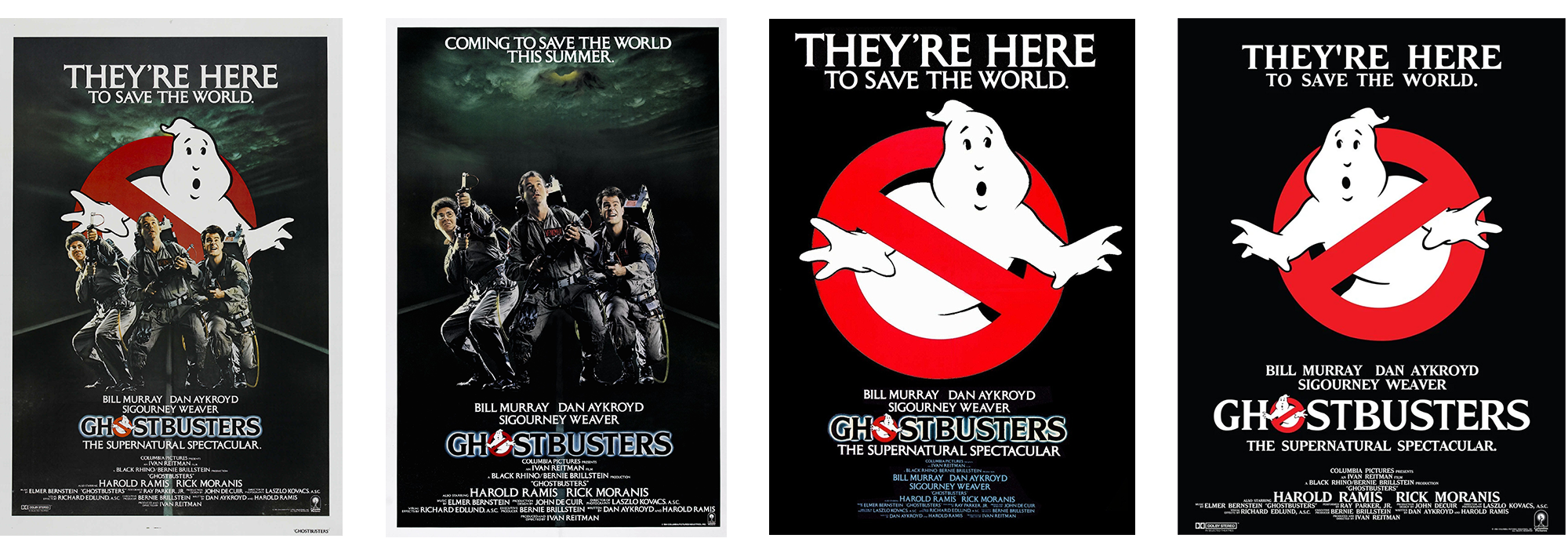
Gross explains that this ‘correct’ version of the symbol (ISO 3864-1, signage buffs), with the crossbar running top left to bottom right, was then only used in Europe where the ‘no’ sign was more familiar than in the US. “We took the word ‘Ghostbusters’ off it – and it’s still backwards – so if you ever see it the ‘correct’ way, that’s for European release,” says Gross. “They said, ‘look we can’t run it backwards over here, we’ve been using it for fifty years’. So it’s two ways; if you see it ‘backwards’, it’s US; if you see it the ‘correct’ way it’s European.” Above is a British poster on the left for the film, with the crossbar top-left to bottom-right, compared with the US version on the right. Notice the second from the left, which is the original US release, has no main Ghost at all. This was because they didn’t get the flipped logo in time for the poster when it was printed. The black versions, which became the standard, had the flipped logo for the US, and the original and correct logo for the EU and UK.
Even as it flipped back and forth across the Atlantic, on its home turf the Ghostbusters logo became so recognisable that versions of it even became a feature of the 1984 US election, with both ‘Reagan busters’ and ‘Fritz busters’ badges appearing in support of Walter ‘Fritz’ Mondale and Ronald Reagan alike.

Versions of the Ghostbusters Logo, the flipped versions and the new Frozen Empire Black version
In 2024, Ghostbusters: Frozen Empire features a dark black logo, which is only the 3rd time the logo has been changed since the 80s. Why has the logo gone dark for Ghostbusters: Frozen Empire? For that, you’ll need to wait until 2024.
Downloadable 4K Wallpaper
You can also download the Frozen Empire Ghostbusters Logo as a 4K wallpaper below. Please note it’s for personal use only. Do not upload it anywhere or alter it. The image is protected both by Digimarc and Pixsy.
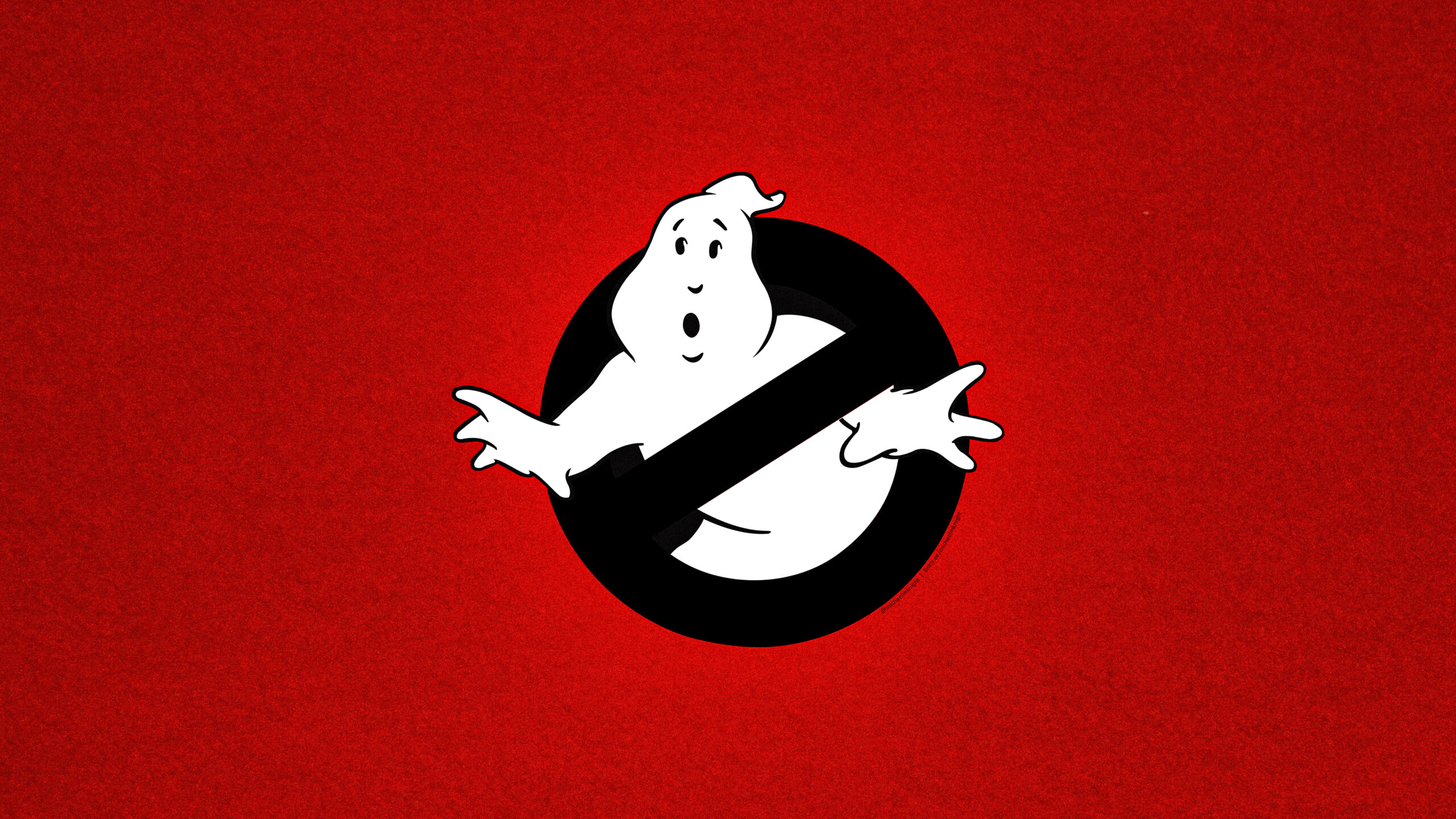
Ghostbusters: Frozen Empire 4K Dark Ghost Wallpaper. Download below.
A reminder, this image is protected both by Digimarc and Pixsy. And it is for PERSONAL USE ONLY.

